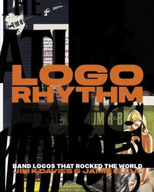
PublishedCirca Press, July 2024 |
ISBN9781911422419 |
FormatHardcover, 400 pages |
Dimensions25cm × 21cm |
The V&A may proudly hold the original artwork for the Rolling Stone's 'tongue and lips' logo, but this is an anomaly. The cultural significance of the band logo has been overlooked. And yet, thousands of people wear them on T-shirts every day, mostly as badges of allegiance, but also simply because they look cool.
Some have even become tropes think The Ramones, Run DMC, AC/DC. (Q: How many people who wear Ramones T-shirts have seen them live or know their music?) Band logos first emerged during the 1960s. They became commonplace in the 1970s and 1980s, when record companies and designers latched on to the power of music branding. Bands and logos may seem like unlikely bedfellows yet it's often the most eccentric, anarchic types who end up with the most compelling or ingenious visual marques to signify their attitude and style of music. It is also interesting how many prominent graphic designers first became interested in logos and letterforms by doodling the names of their favourite bands on their school exercise books. Some of these efforts were reverential copies, others were improvements or embellished versions of the original. A wannabe designer's version of attempting to emulate a Hendrix riff. Logo Rhythm includes stories and insight from well-known designers such as Beatles art director Kosh, Bowie designer Jonathan Barnbook, Malcom Garrett, Rob O'Connor of Stylorouge, Chris Bigg of 4AD and editorial guru Mark Porter. There are contributions from Horace Panter of The Specials, XTC's Andy Partridge, Allan Gorrie of Average White Band, Jim McCarty of The Yardbirds and Alex Kapranos of Franz Ferdinand. The book hails the unsung heroes and tall stories behind iconic band logos of all genres. It unearths original artwork and proffers informed comment and critique. It celebrates the good, the eccentric and the notorious, digging for nuggets of interest and illumination in the compelling world of band logos. AUTHORS: Jim K Davies is one of the UK's most highly awarded copywriters. He works with design agencies and brands to help them tell their stories. A former Guardian journalist, he's written for design publications the world over from Domus in Italy, to Idea in Japan, to Print in the US. Author of The Book of Guinness Advertising and several acclaimed books on philatelic design, Jim is a huge funk and soul fan. Two of the happiest (and most drunken) weeks of his life were spent as an intern at music paper Melody Maker. Jamie Ellul is founder and creative director of Supple Studio, a small Bath-based design and branding agency that thinks big. He's a multi-awarded member of D&AD and a seasoned book designer having created books for Thames & Hudson, BBC Books and Royal Mail. Jamie previously worked at several of London's most-lauded creative studios, including hat-trick, The Partners and Magpie the latter set up with friends from art college. An accomplished bass player and a member of upcoming bands The Super Colours and The Mystery Callers, he'd happily trade all his success in the world of design for a record contract. SELLING POINTS: . Unrivalled, fascinating, and original insight into an overlooked field of popular culture the art of the band logo . The result of six years' researching, interviewing, writing and general obsessiveness . A visually rich and varied book, with contributions from leading figures in the music and graphic design worlds 400 colour illustrations

